


//Packaging Design, Branding, Logo Design, Photography
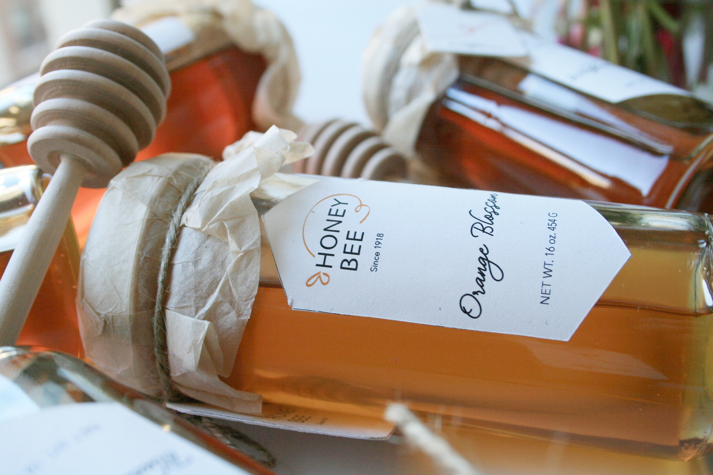
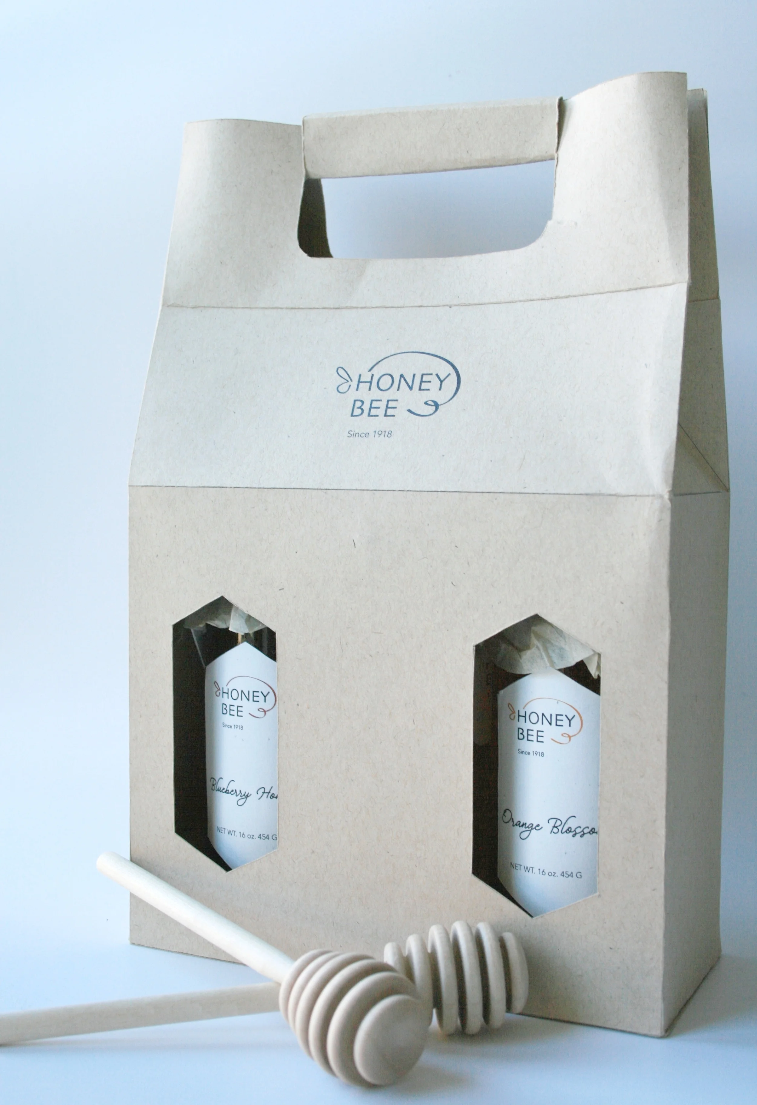
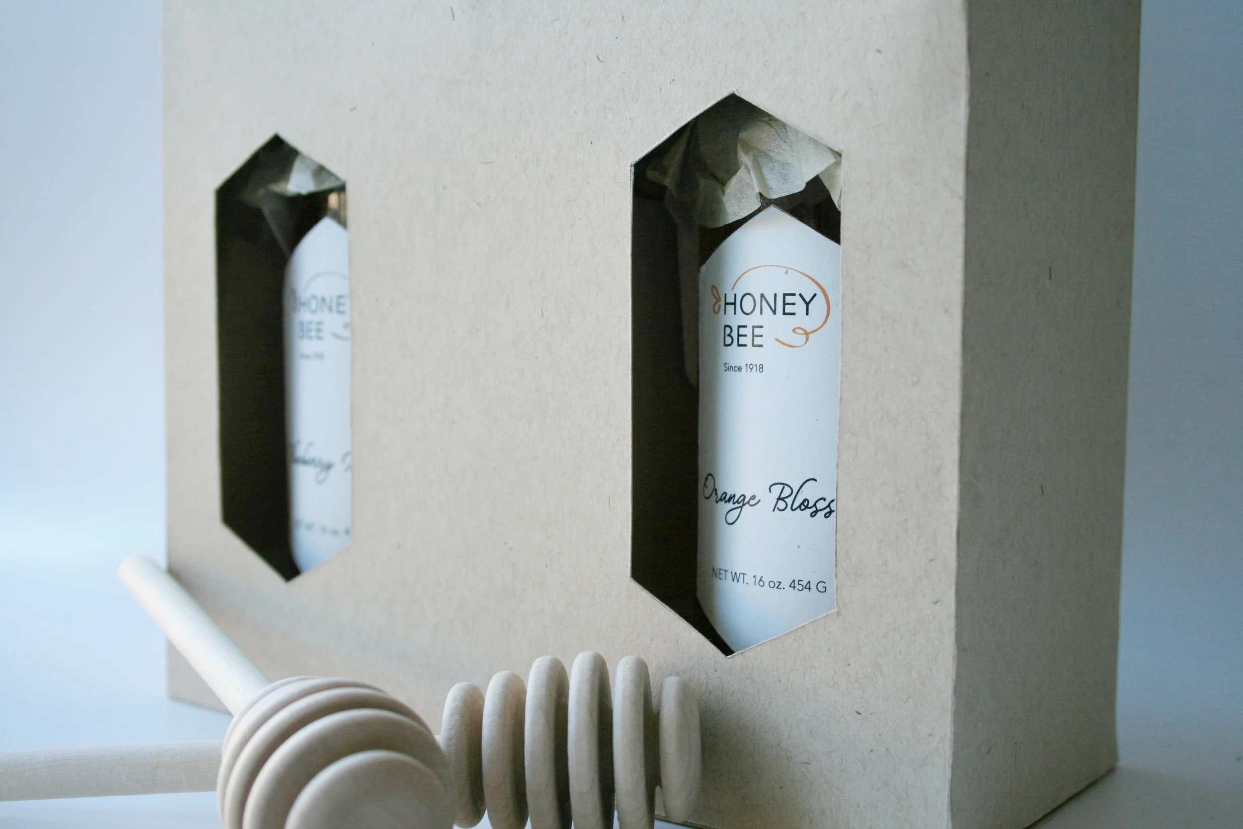
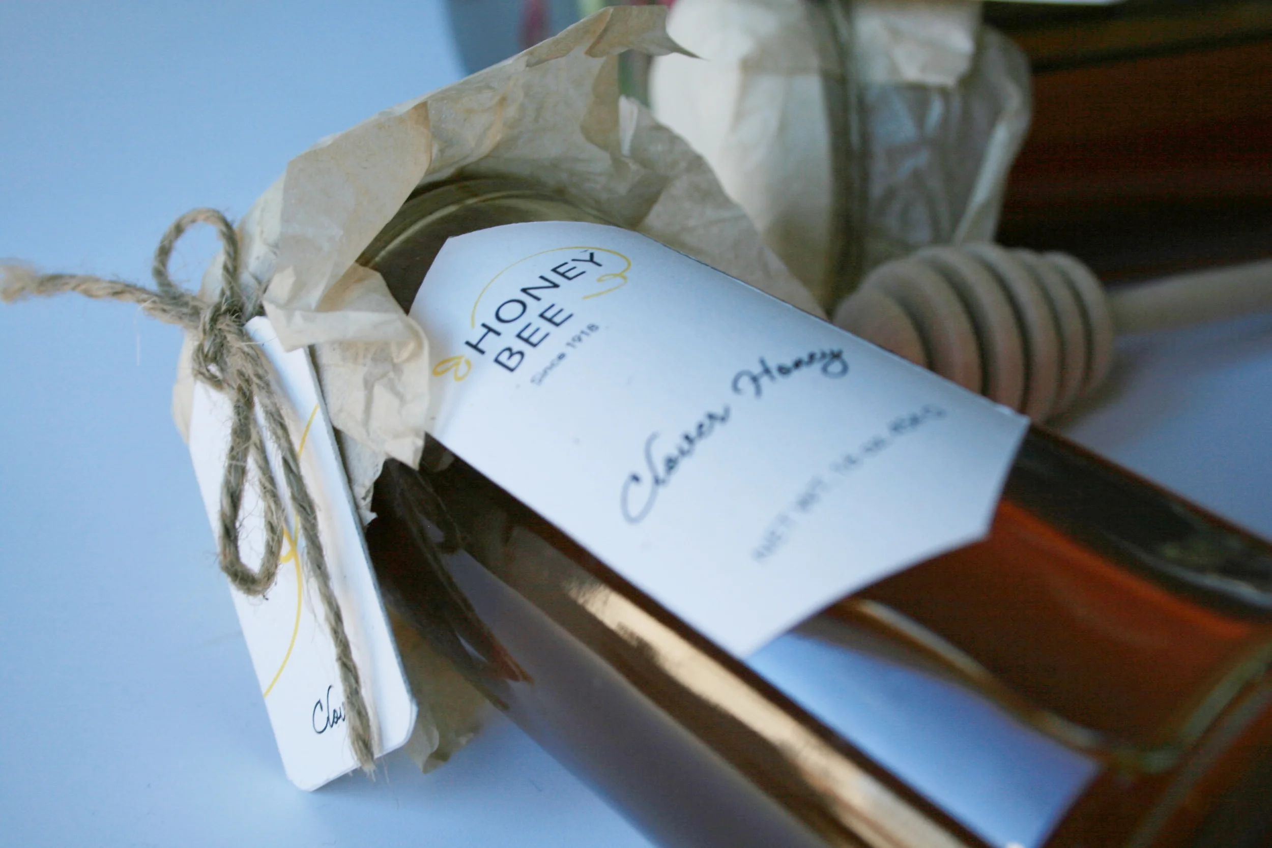
The choice of the paper of the packaging gives a sense of organic feel of the product that is inside. I used the shape of a hive as the hole on the package to let customers to see the honey, also as the label on the bottle itself to create a consistency of the branding.
The logo honey bee is inspired by the movement of bees, the organic curve shape that gives the logo itself a sense of energy and liveness that shows the relationship between bee and honey.