//Infographic Design
An information design poster to illustrate the 2003 blackout of the Northeastern United States and parts of Canada. By laying out all the complex information in the simplest way possible, this poster makes it easy for the audience to understand the whole cascade of events that contributed to the blackout.
//Branding, Identity System
A logo redesign for Los Angeles County Museum of Art.
//Branding, Typeface Design, Brochure Design, Book Design, Photography
This is a brochure for the Art Design Chicago event. The aim is to be innovative, attractive, easy to use and navigate, and express the event in a fresh and innovative manner.
Chicago is world-famous for its plethora unique architectural styles, I use geometric shapes to implicate that and create a new set of identity for this brochure.
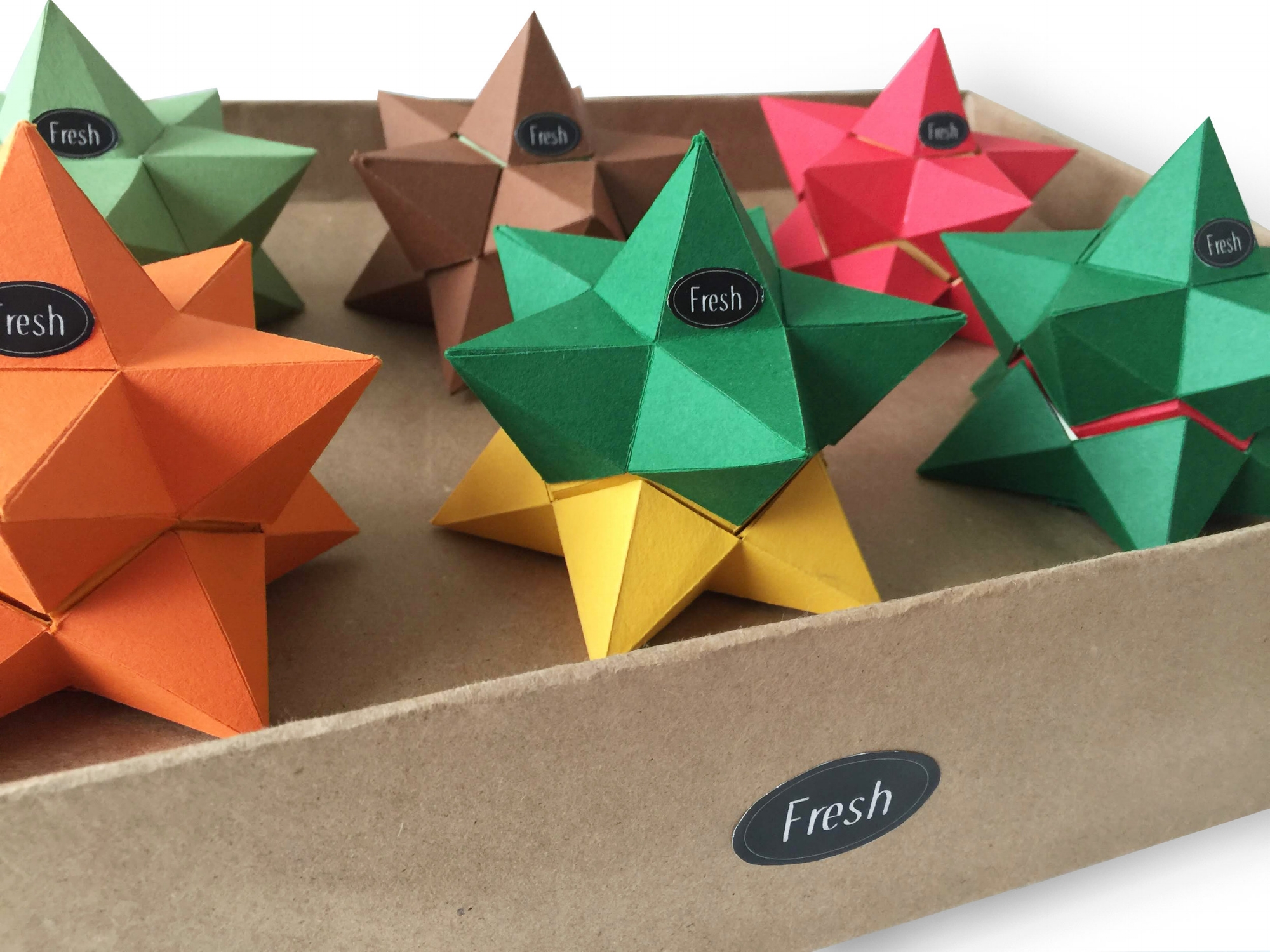
//Packaging Design
Exploring the relationship between different solids, I combine dodecahedron and icosahedron to put the small stellated dodecahedron back together as a whole. The fruit itself becomes the package by utilizing geometric forms to represent each organically shaped fruits
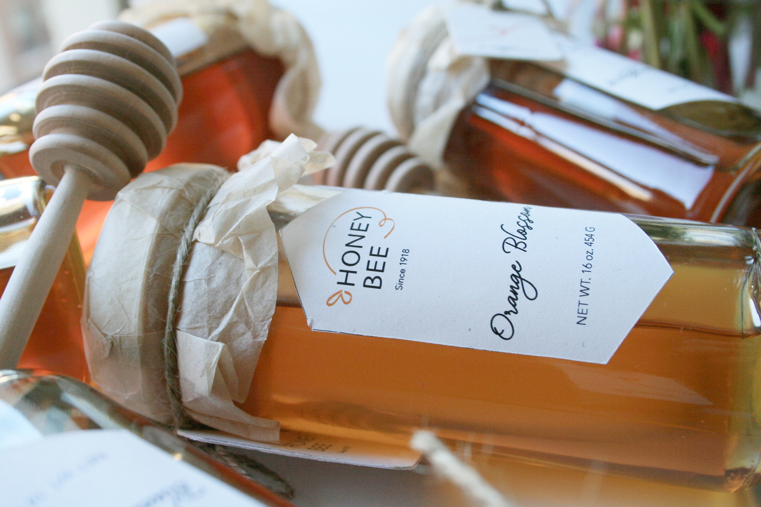
//Packaging Design, Branding, Logo Design, Photography
The choice of the paper of the packaging gives a sense of organic feel of the product that is inside. I used the shape of a hive as the hole on the package to let customers to see the honey, also as the label on the bottle itself to create a consistency of the branding.
The logo honey bee is inspired by the movement of bees, the organic curve shape that gives the logo itself a sense of energy and liveness that shows the relationship between bee and honey.
//Form Design, Typography, Layout Design
I was given the task to redesign the Jury Duty form, the challenge was to redesign it completely while still keeping all the same information, with the limit of two letter size pages. I chose the color blue for the overall color skim in order to give a cleaner and simple look to it.
//Book Design, Creative
A little booklet illustrating the poem "The Dream" by Daniil Kharms.
//Branding, Identity System
Alex's Lemonade Stand is a foundation that focuses its research on supporting the cure for childhood cancer. The lemon pieces come together to signify that this foundation pulls hearts together as a whole and provides hope to its community. The blue lines show a burst of energy and represents the empowerment that this foundation offers.
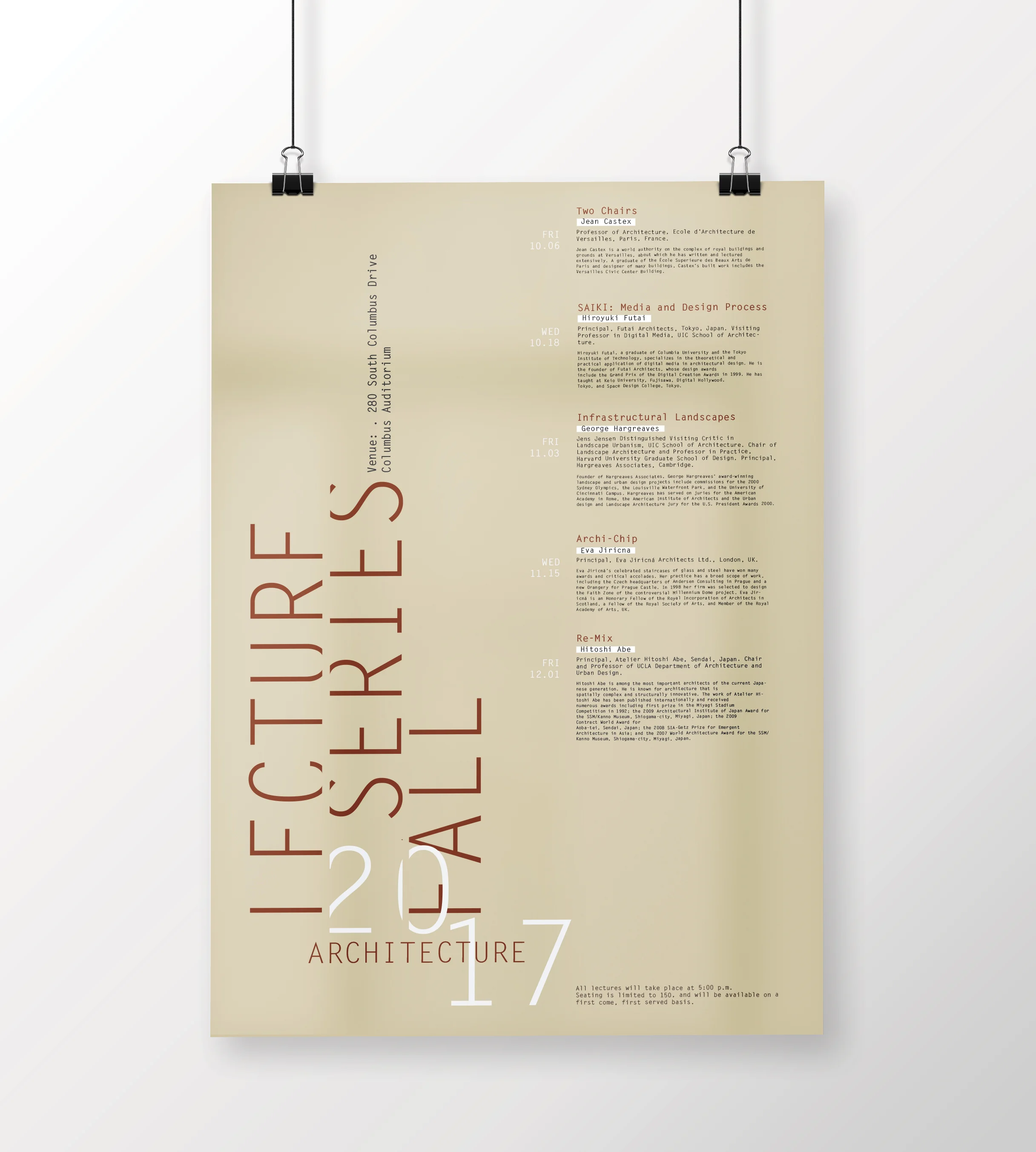
//Poster Design, Typography
A poster inspired by Hitoshi Abe's work.
//Book Design, Process Book
A process book tells you how to prepare and make bubble tea from the beginning to the end.